
Consider Contrast When Picking Colors
An important design consideration for accessible content is color contrast. Contrast between foreground and background ensures legibility, which is essential for sighted users.
The Americans with Disabilities Act (ADA) Title II requires all university websites, mobile applications, documents made available online and digital course materials must be fully compliant with WCAG 2.1 Level AA accessibility standards by April 24, 2026.
Color Contrast
Color contrast ensures objects in the foreground can be distinguished from the background. High contrast is especially important for text color compared to its background. You can use tools to measure the contrast between two color values to determine if they meet accessibility guidelines.
The Web Content Accessibility Guidelines (WCAG) 2.1 defines minimum contrast ratios for normal text, large text and meaningful graphical elements.
WCAG contrast ratios based on content type
| Compliance Level | Normal Text | Large Text* | Meaningful Graphical Elements** |
|---|---|---|---|
| WCAG AA | 4.5:1 | 3:1 | 3:1 |
| WCAG AAA | 7:1 | 4.5:1 | N/A |
* Large text is defined as either 14+ point (~18.66px) and bold or 18+ point (~24px).
** Meaningful graphical elements: Elements that a user needs to be able to perceive in order to understand or interact with content are considered “meaningful.”
Tools for Checking Contrast
- WebAIM Contrast Checker: This tool measures the contrast between two colors and whether or not it meets WCAG contrast standards.
- WhoCanUse: This tool brings attention and understanding to how color contrast can affect different people with visual impairments.
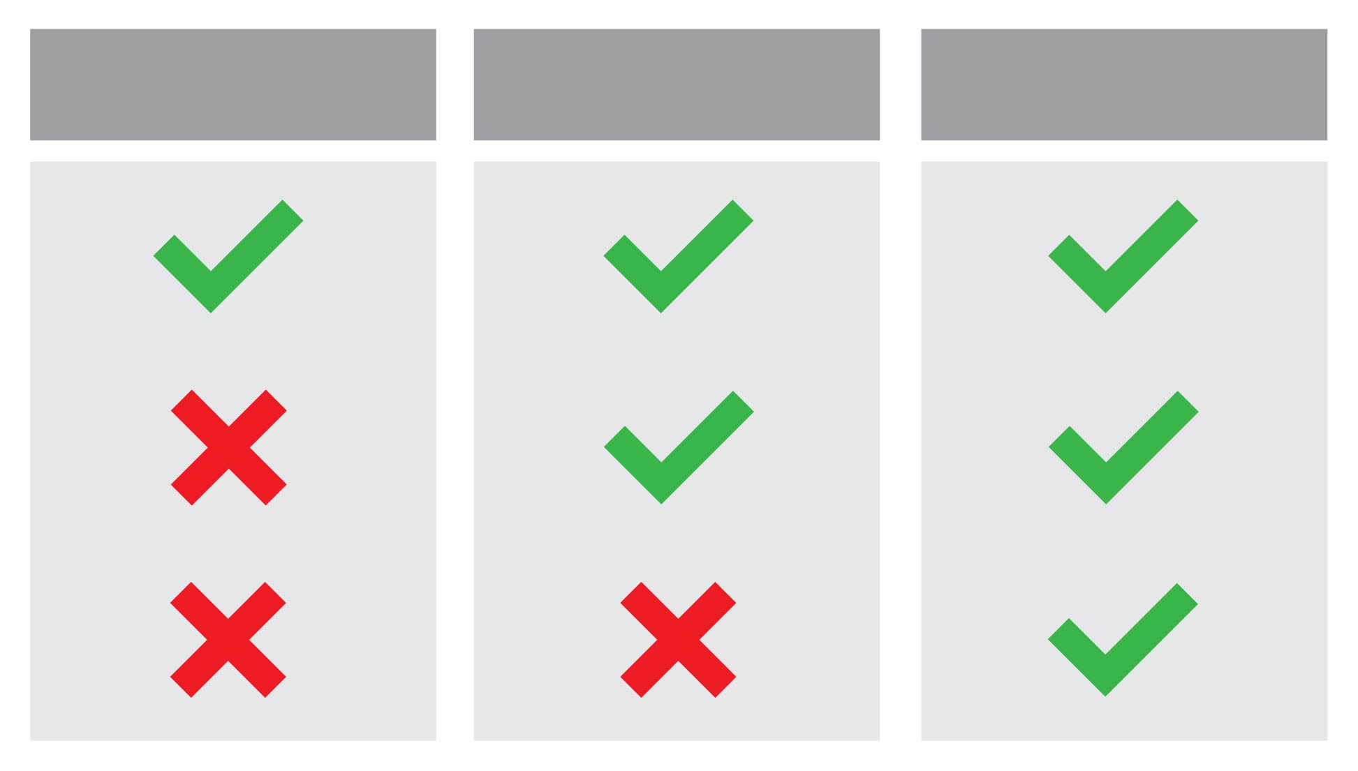
Don’t Use Color Alone to Convey Meaning
Don’t use color alone to convey meaning. People who use screen readers will not have access to information that is provided through color alone. Additionally, people who are colorblind perceive colors differently. Using color alone to convey meaning assumes everyone perceives colors the same way. It is also recommended that you check your colors using a color blindness simulator to ensure people with color blindness can still perceive your content.
Red and green are often used to convey meaning, but not everyone can distinguish between these colors. Additionally, when graphics are printed out on a black and white printer, it is impossible to distinguish between the colors.
Use Secondary Indicators in Addition to Color
Quickly and clearly convey meaning to people by combining meaningful color with secondary indicators.
Icons
Using icons can be a helpful way to provide visual cues about a piece of content. Note: If you are using icons without associated alt text, you will also need to pair them with text labels.
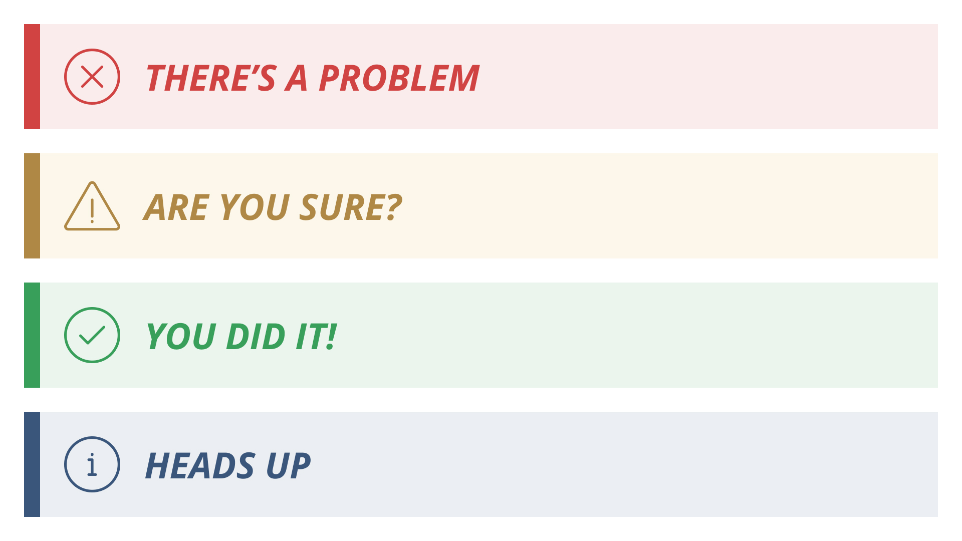
Text Labels
Text labels are helpful in combination with other indicators. The text can be essential for clarity, while other indicators can help with quickly parsing information.

Text Styles
Using a variety of styles (bold, italic, etc.) can be a visual indicator that helps convey meaning — such as whether or not something is interactive.
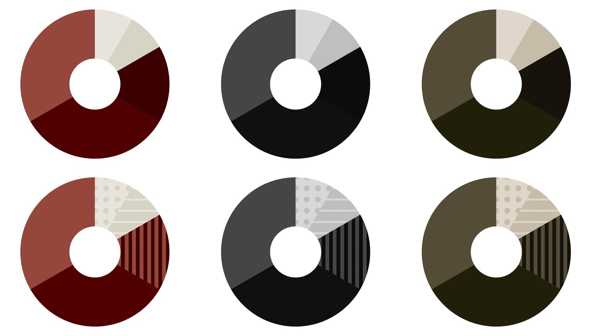
Patterns
Using patterns can be a helpful way to ensure different sections of a chart are distinguishable from each other.
Colors in Aggie UX
Aggie UX uses a brand-compliant and contrast-ready color palette. All variations of our components are tested to ensure they meet WCAG Level AA contrast requirements.
Use Siteimprove to Find Issues with Color Contrast
Siteimprove can help you find accessibility issues related to color contrast on your webpages.
Find and Address Issues with Contrast
To see if you have any of these issues on your site:
- Log in to Siteimprove.
- On the left side menu, open Accessibility > Issues.
- On the Issues table, set the filters to Responsibility: Visual Design.
- Click on each issue to get more information about how to address the issue and see affected pages.
- Repeat this process on the Potential Issues (Accessibility > Potential Issues) page to review occurrences that need a human to review to see if they are issues.
Once you have identified the issue, go into your content management system (CMS) to address the issue and publish your changes.
After the page has been republished with your changes, go back to Siteimprove to rescan that page to see if the issue has been resolved.
Get Access to Siteimprove
All Texas A&M University website owners have the ability to monitor the accessibility (and quality assurance) of their sites using Siteimprove. Use Siteimprove to identify potential issues, learn how to address them and watch your scores over time. If you are responsible for a Texas A&M website, email web@tamu.edu with your name, NetID and the sites you are responsible for to get access.