
Tips for our Photography
Elements of Our Photography Style
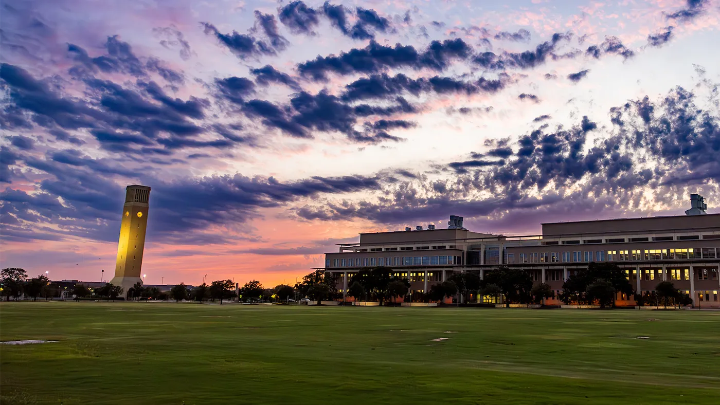
Our photography distinguishes the Texas A&M brand and plays a major role in how we communicate. Whether we’re using existing photos or capturing new options, each image should fall into one of the following categories: epic, working together, portraiture, spirit or details.
Discover our Photography styles
A compelling image requires the right balance of many elements: composition, subject, lighting, equipment and more. The following guidance on photography techniques is designed to help establish a consistent and unique approach for capturing images to articulate the Texas A&M story.
Not every technique will apply for every scenario we photograph. But with a variety of approved compositional techniques at their disposal, our photographers have greater flexibility to capture interesting and compelling images in any situation. These techniques also help our collective photo library to have a consistent look and feel.
Obstructed Foreground
To help visualize a sense of depth and immersion, we look for moments in composing a shot where the foreground can be intentionally obstructed.
Typical photos are free of obstruction: All elements of the composition support the main subject and generally lead the viewer’s eye right to it. What we’re after is something different. Intentional obstruction is exactly what it sounds like: You photograph the scene with an obstruction in the foreground, such as the silhouette of a person’s shoulder, or the edge of a table or lab equipment. Building layers of moments and framing one interaction with another — these are essential components of how we visualize depth and immersion.
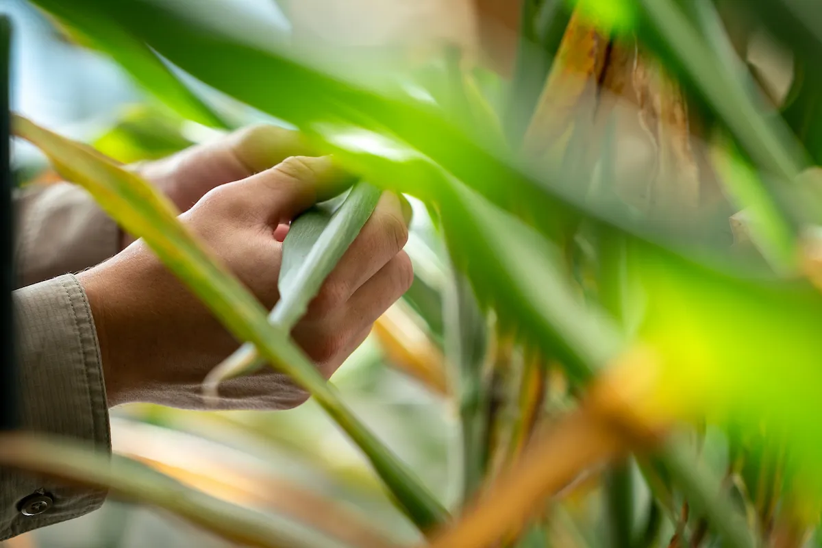
Using leaves to intentionally obstruct the foreground on the right side of the frame creates a more immersive and dynamic composition to this photo.
Lighting
Our images are authentic and grounded in reality. Therefore, we prefer natural lighting and use lights when necessary for creative effect.
Light sources should never come from the same angle as the camera — this flattens the image and removes the shadows. Dramatic lighting can add interest to static scenes, but should not be overused. In the edit, make sure color correction and contrast feel natural and unfiltered.
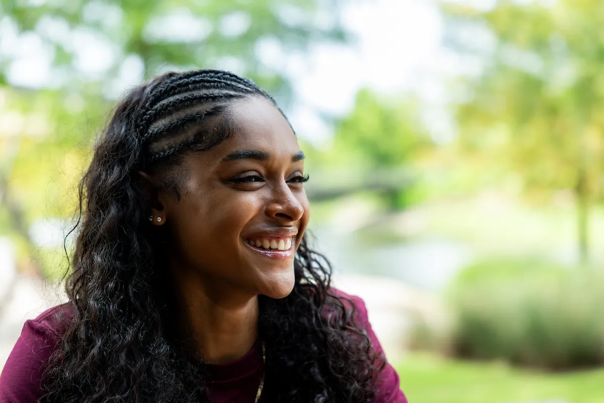
The subject in this photo is lit from the side, casting gentle, lifelike shadows across the face that give the image an authentic, natural quality.
Subject Hierarchy
Pay attention to the visual hierarchy, the placement of subjects, who is and isn’t in focus — and consider what dominant narratives these choices might be reinforcing.
Ask yourself: Who is presented as the main character? Who is presented as a supporting character? Is the message being conveyed through the image sending the intended impression we want to portray?
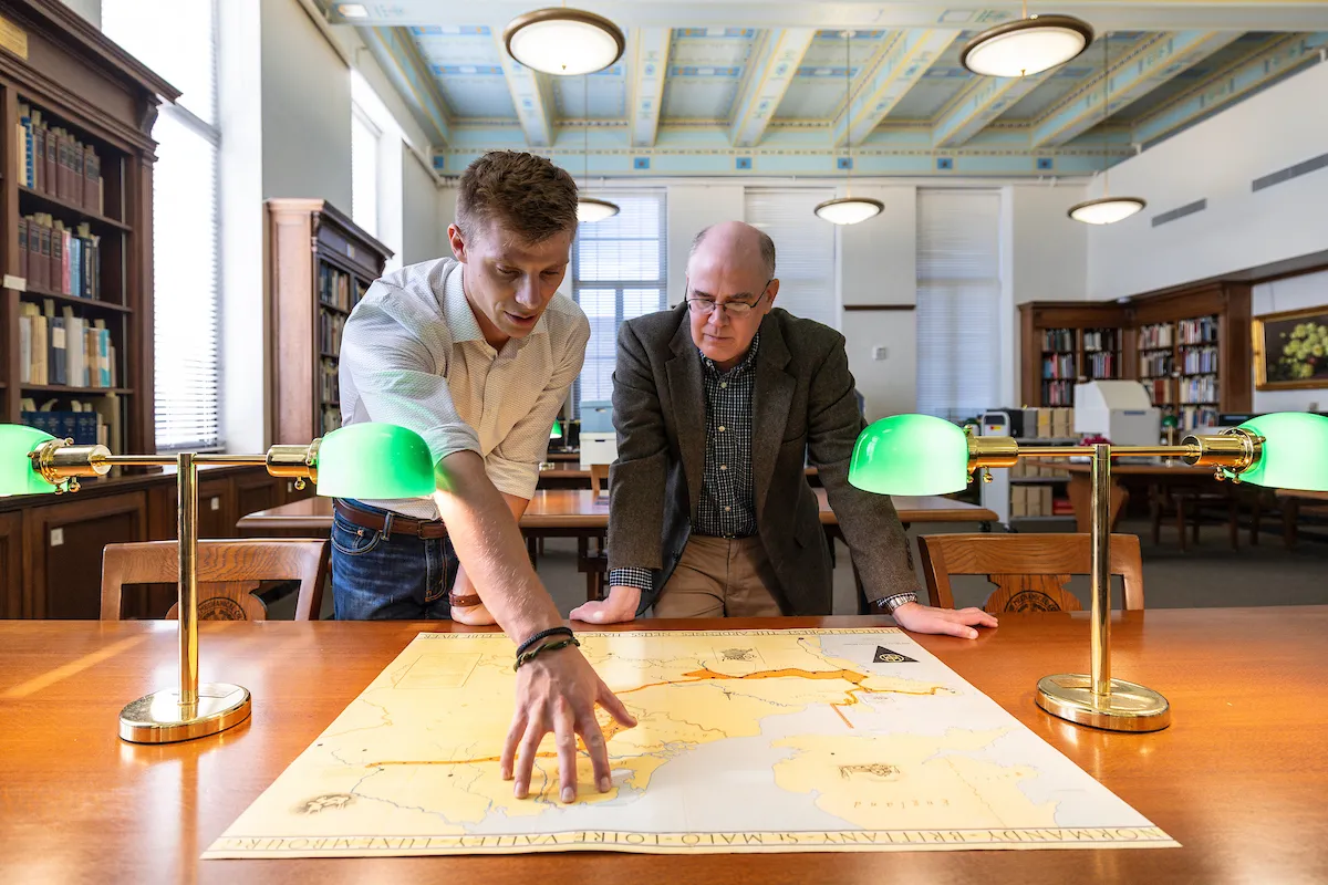
Although both subjects in this photo are engaged in the activity, the figure on the left performs the dominant action, enhancing the image’s storytelling quality. Positioned in the foreground, the subjects remain central while the wide framing provides context of place.
Tone-on-Tone
Tone-on-tone photography can be used to complement full-color images or as a background element. Use the color values below to guide your editing processes.

Maroon Duotone
Shape: C=15 M=100 Y=39 K=69 | Image: C=52 M=100 Y=90 K=90

Charcoal Duotone
Shape: C=67 M=63 Y=63 K=57 | Image: C=87 M=79 Y=80 K=73
Color Correction
There are a few simple steps to creating consistent, rich photography for use across all marketing materials. The specific values will vary depending on the original image, but the idea is to create a warm, crisp image with clear contrast and vibrant color.
- Create a Brightness/Contrast adjustment layer. Increase the contrast to get rich blacks and sharp highlights.
- Create a Color Balance adjustment layer. Add warm tones and reduce cool tones for highlights, midtones and shadows. Be careful not to oversaturate. The colors should still appear natural but have a subtle warmth.
- Output the image in the appropriate color mode. RGB for digital, CMYK for print.

Adjusted vs. original
Photography Dos and Don’ts
Do:
- Do aim for realistic and candid photos
- Do show subjects engaged in activity
- Do have working/studying subjects appear focused and studious
- Do show a clear purpose/topic for working/studying photos (genetics, meteorology, etc.)
- Do have recreational photos that are inclusive and lively
- Do have subject dressed normally or in appropriate attire for the activity shown
- Do show populated and active campus/building shots
- Do show a range of compositional techniques across the entire photo library
Don’t:
- Don’t over-stage subjects
- Don’t have subjects interacting with or looking at the camera (except portraiture)
- Don’t show subjects unengaged with their setting (except portraiture)
- Don’t show generic studying shots where the purpose/topic isn’t clear
- Don’t over-brand subject’s clothing
- Don’t show sedentary, unengaged subjects
- Don’t use flat, one-dimensional compositions
- Don’t over-light scenes