
Aggie UX Image Templates & Optimization
Use these Photoshop templates and best practices to create high-quality, fast-loading images for Aggie UX Design System components. Each download includes cropping guides for the correct aspect ratios and sample layer sizes for export.
Downloads
16:9 Images (Non-responsive)
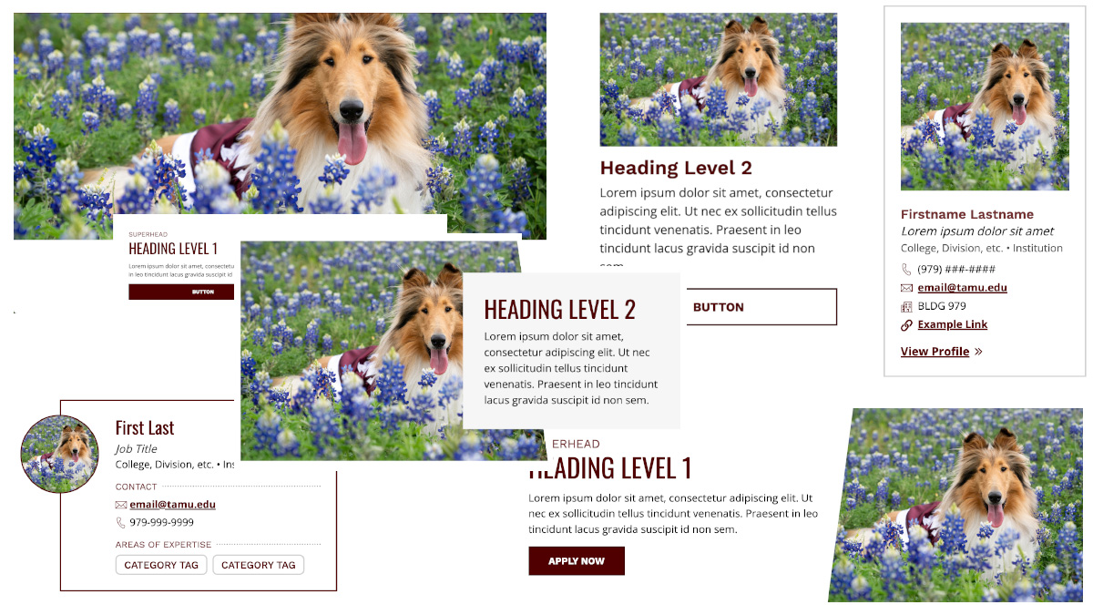
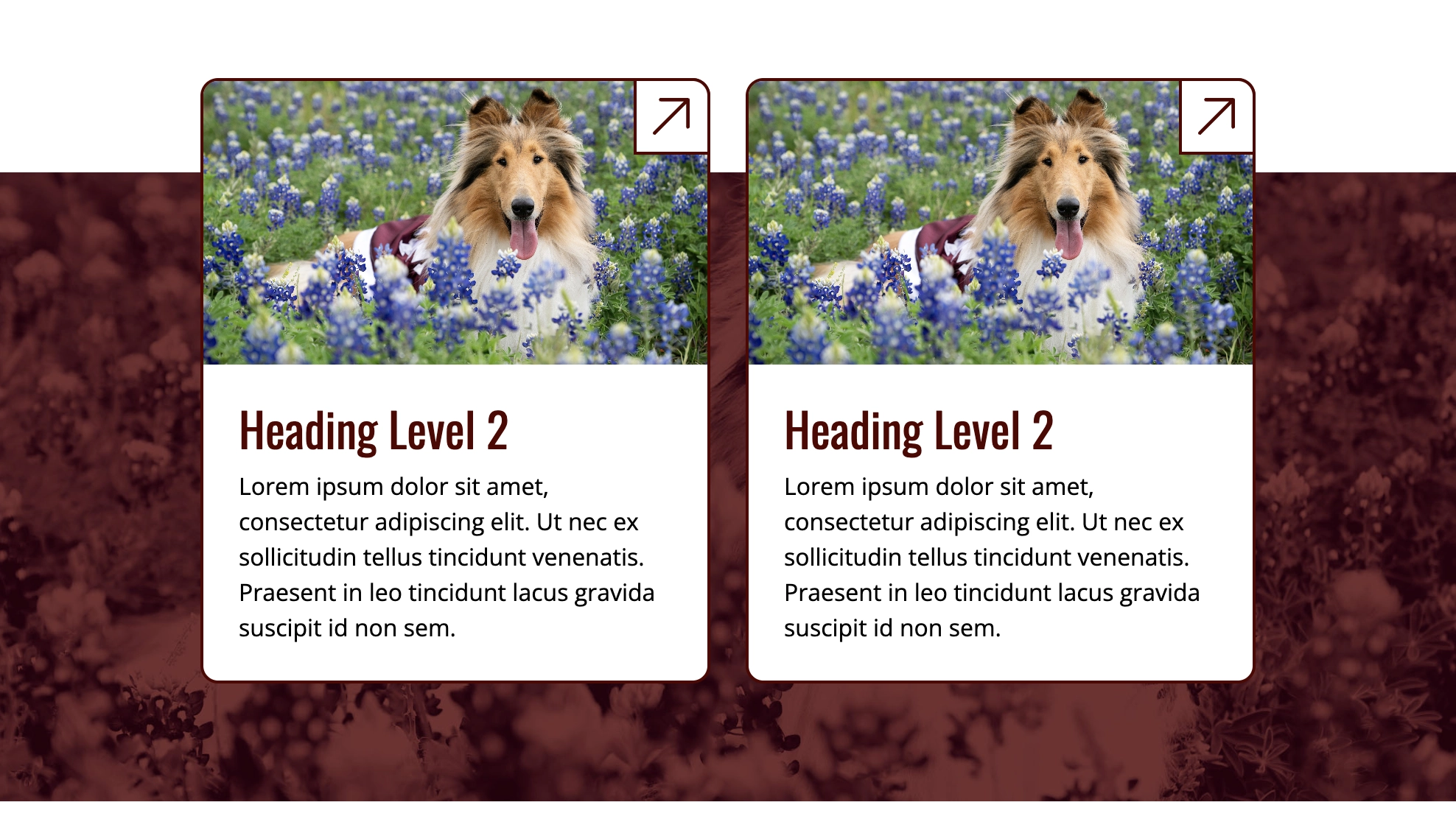
Use this template for Aggie UX components that use 16:9 images that do not get cropped responsively depending on browser width. These include images in: all cards in card groups, card slabs and split features; callouts; media slabs; and testimonial collections. Images should not exceed 1500px in width and should be optimized to 500KB or less (maximum 1MB). In many cases, you can resize the images to be 1000px wide or smaller to help optimize image size.
16:9 Responsive Background Images
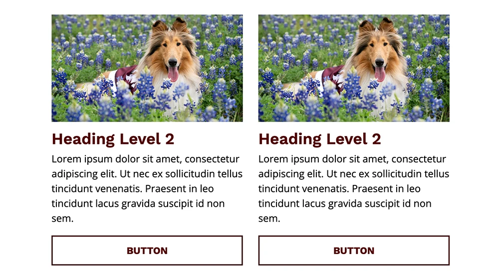
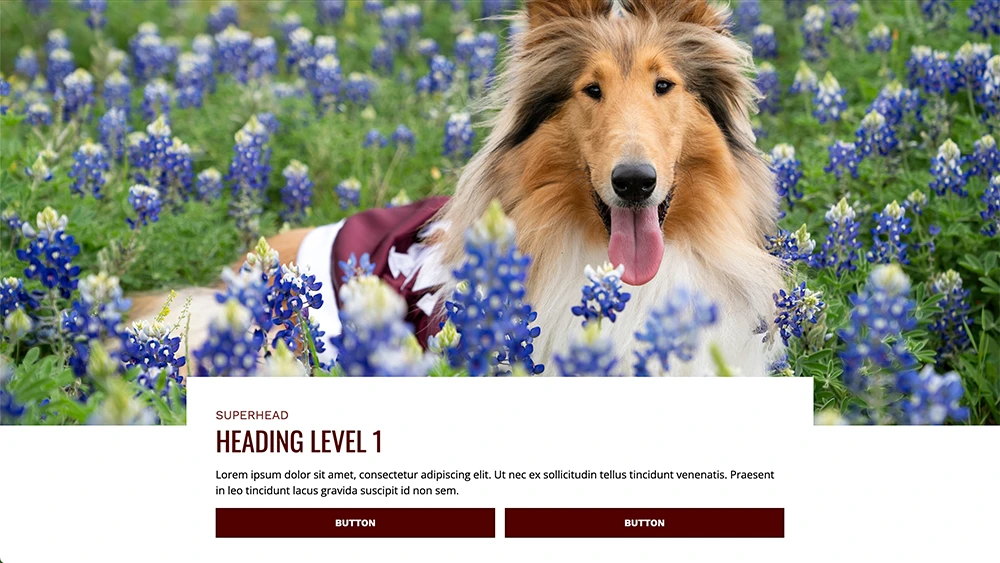
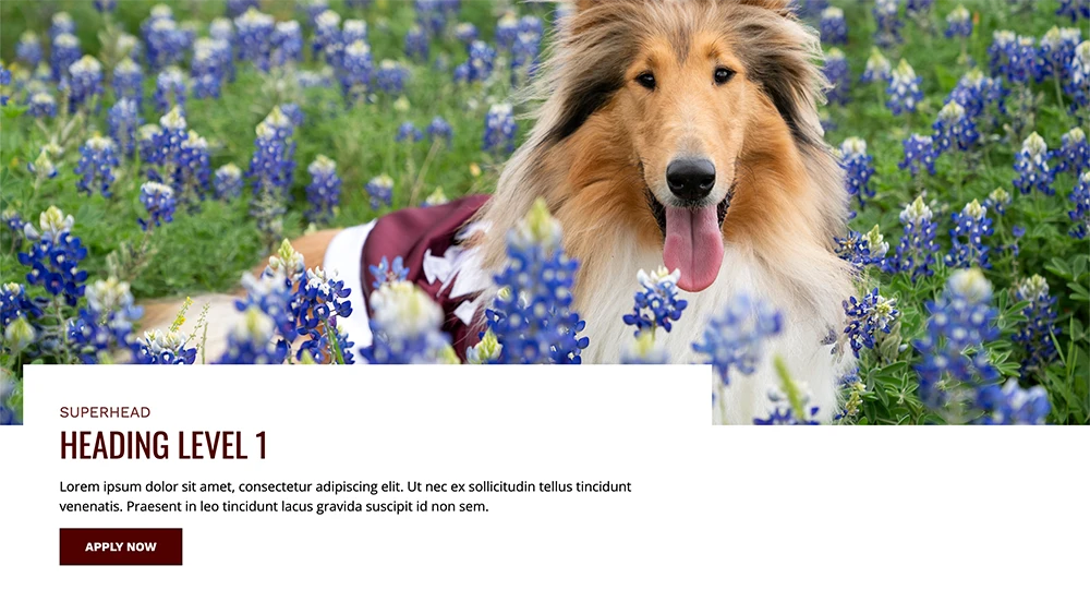
Use this template for Aggie UX components that use 16:9 background images get cropped responsively depending on browser width. These include images in: CTA features; media features; split features; standalone blockquotes; and standard page headers. Use the rulers in this template to make sure the focal point of your image inside the guides, ensuring the most important parts of your image are visible at most browser widths and screen sizes. Images should not exceed 1500px in width and should be optimized to 500KB or less (maximum 1MB). In some cases, you can resize the images to be 1000px wide to help optimize image size.
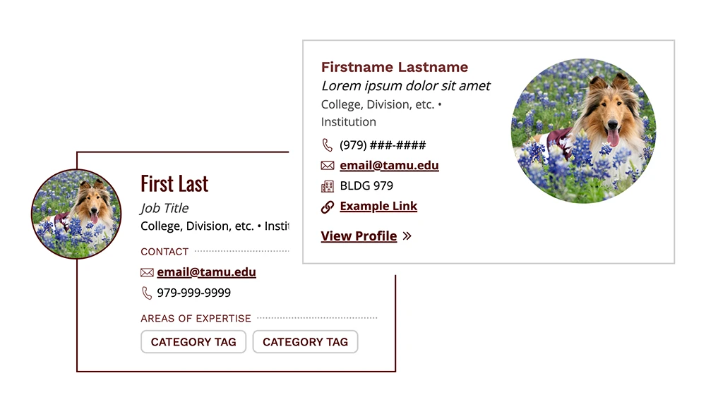
Contact Card and Profile Header Circle Headshots
Both the contact card collection options A and B and the profile page header can display a circular profile image. Upload a square (1:1) photo — the circular crop will be applied automatically with CSS. To preview how the image will look when cropped to a circle on an Aggie UX site, you can turn on the “GUIDES” layer in the layers panel, but be sure to HIDE the guide layer BEFORE exporting. Images should not exceed 1000px in width and should be optimized to 500KB or less (maximum 1MB). In many cases, you can resize the images to be smaller to help optimize image size.
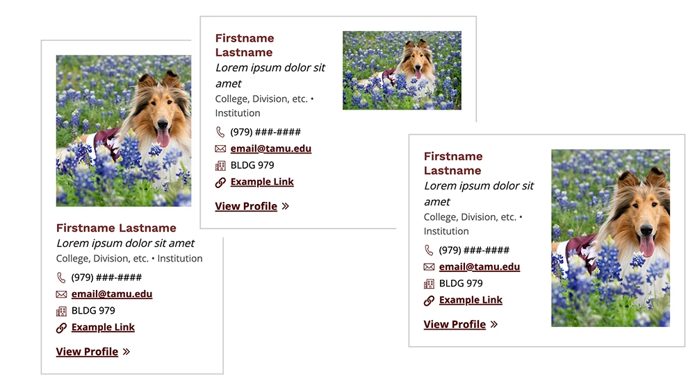
Contact Card Square, Portrait and Landscape Headshots
Contact card collection option B has many options for displaying images, including square (1:1), landscape (6:4) and portrait (4:6). Images should not exceed 1000px in width and should be optimized to 500KB or less (maximum 1MB). In most cases, you can resize the images to be 800px wide or smaller to help optimize image size.
Maroon Duotone Overlay
Some components, such as split features and page headers, may use decorative background images. We recommend using this maroon duotone overlay over background images to help the background not compete with content in the foreground. While not required, this effect adds depth and helps maintain a cohesive, branded look across the site.
Home Page Header Images and Video
Home page headers support different media heights (narrow, standard and tall). For each height, the media will display in the same aspect ratio up until very large screen sizes, where it will maintain a specific height but crop the media to center. The aspect ratios for each option are as follows:
- Narrow = 2.5:1
- Standard = 2:1
- Tall = 1.5:1
Landing Page Header Images and Video
Landing page headers have the option for different image heights (narrow, standard and tall). For each image height, the image will display in the same aspect ratio up until very large screen sizes, where it will maintain a specific height but crop the image to center. The aspect ratios for each option are as follows:
- Narrow = 3:1
- Standard = 2.5:1
- Tall = 2:1
Optimizing Images for Web
Images used in Aggie UX Design System components should be high-quality, accessible, and optimized for fast loading. Follow the guidelines below to prepare and export your images correctly.
General Guidelines
- Use RGB color mode (not CMYK) for all web images.
- Image width should not exceed 1500 px.
- Optimize file size to 500 KB or less (maximum 1 MB).
- Use JPG and/or WebP for photos and SVG for vector artwork.
- Use PNG only when transparency is required, as PNG files are typically much larger than other formats.
- Both WebP and SVG are fully supported in Cascade and WordPress.
Note: Emerging formats like AVIF and JPEG XL offer even better compression and will be added once browser and CMS support improves.
Preparing Images in Photoshop
- Open the appropriate template.
- Place your image and align it within the crop guides.
- Save for web:
- Go to File › Save As › WebP
- Choose Lossy compression
- Set Quality = 90%
- Click OK to save
Optional: Optimize After Export
Further reduce file size using a compression tool.
Recommended tools
- Web/Desktop: Kraken (online only), Caesium (online or desktop), Cloudinary, ImageOptim (for JPG, PNG, GIF)
- WordPress plugins: EWWW Image Optimizer
- Other options: JPEGmini, PicMin, ShortPixel
Accessibility Considerations
As a public institution, Texas A&M is responsible for ensuring that all digital media is accessible to everyone. Always include descriptive alt text and verify sufficient color contrast.
Additional Resources
View curated galleries of photography for use on official Texas A&M University projects.
This guidance on photography techniques is designed to help establish a consistent and unique approach for capturing images to articulate the Texas A&M story.
As a public institution, Texas A&M is responsible for ensuring that all digital media is accessible to everyone. Learn more about accessibility best practices.
Contact
For questions, email Texas A&M Aggie UX Team.