Graphic Elements
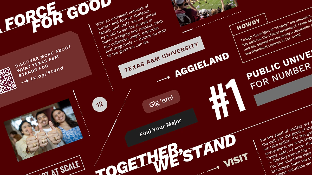
Integrating these accents into your Texas A&M marketing materials helps add visual consistency to our brand. For more details about creating and using these elements can be found in the Visual Style section of Texas A&M's Brand Guide.


Linework
Linework supports compositions with structure and embellishment while reinforcing the specific needs of the piece. Linework in Texas A&M’s branding is not a primary graphic driver but can act as a supporting visual. For details on how to build linework, check out the Visual Style section of Texas A&M’s Brand Guide.

Emphasis Box
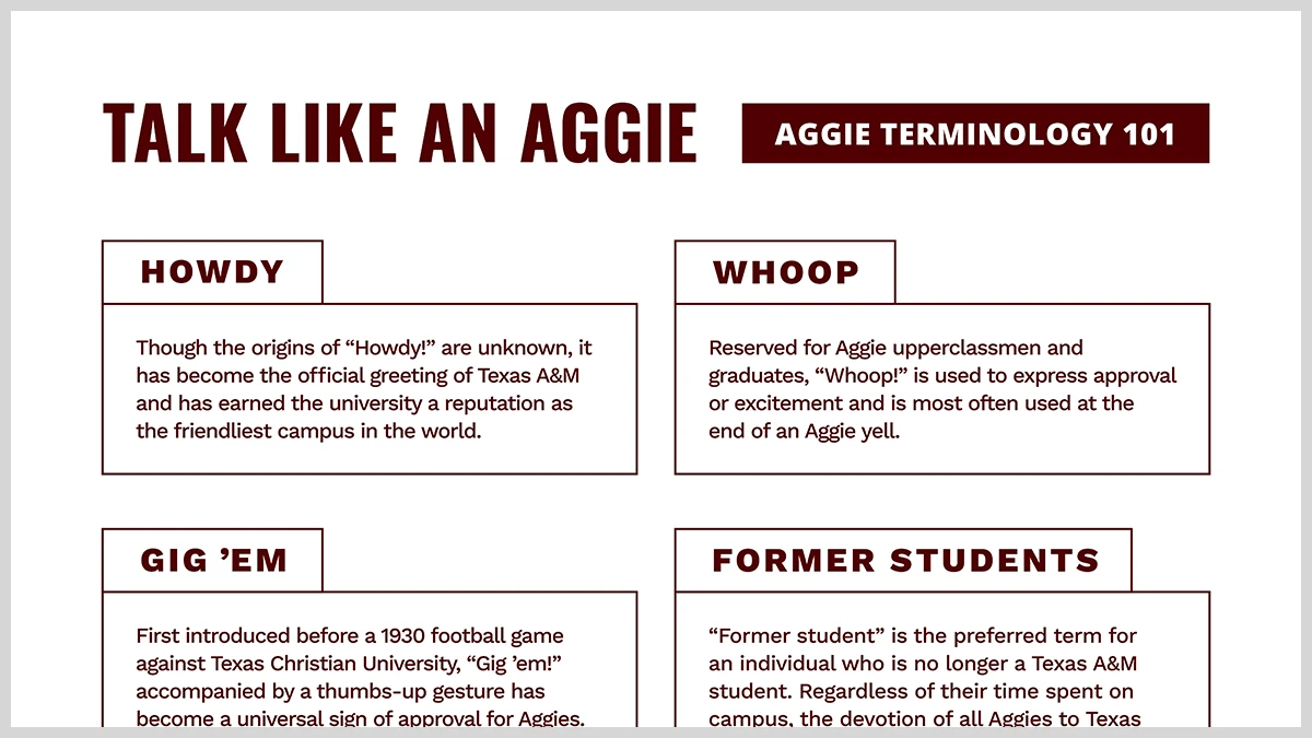
Keywords, callouts and labels can be given extra weight when placed within one of our emphasis boxes. These rectangular shapes can be filled with our primary colors (when applicable) or outlined with a transparent fill to allow the background to come forward. For more examples and inspiration, check out the Visual Style section of Texas A&M’s Brand Guide.

Headline Style Accent
For hero headlines or impact callouts, two lines of Work Sans Extra Bold Italic can have a horizontal stroke tether the space between the baseline of the top line of text and the cap height of the lower line of text. The line’s horizontal reach is variable to the composition’s needs. For details on how to construct this headline style, check out the Visual Style section of Texas A&M’s Brand Guide.

Photo Collage
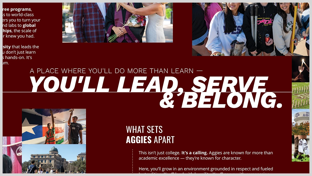
This compositional approach to photography allows for several different-sized containers to form a collage and allows for various photo category assets to be displayed. This is beneficial in showing all parts of a story: the individual, location and work at hand or a collection of different moments centered around a theme. These photo collages rely heavily on a balance of our brand photo styles and how they work together. For more examples and inspiration, check out the Visual Style section of Texas A&M’s Brand Guide.
Discover our photography stylesDownload Design Elements
Use the design elements on this page to create a consistent look and feel across all of your marketing and communications materials. It is not necessary to use all of the elements together in every application.