
Visual Style
How Our Brand LooksTo establish audience recognition and trust, it is vital that brand look and perception is consistent through all colleges, departments, offices and divisions. Our visual language sets the tone for how people see us initially and how they recognize our brand thereafter. This includes typography, photography, graphic elements and color. More significantly, all these pieces work together to convey our message and strengthen our overall brand.
Visual Style Resources
Texas A&M University uses several important logos and marks. Each has a specific role in representing the university. Identity assets must never be manipulated, altered or modified for use by other entities.
Beyond our logo, color is one of the most recognizable aspects of our brand identity. Using color appropriately is one of the easiest ways to make sure our materials reflect a cohesive Texas A&M brand.
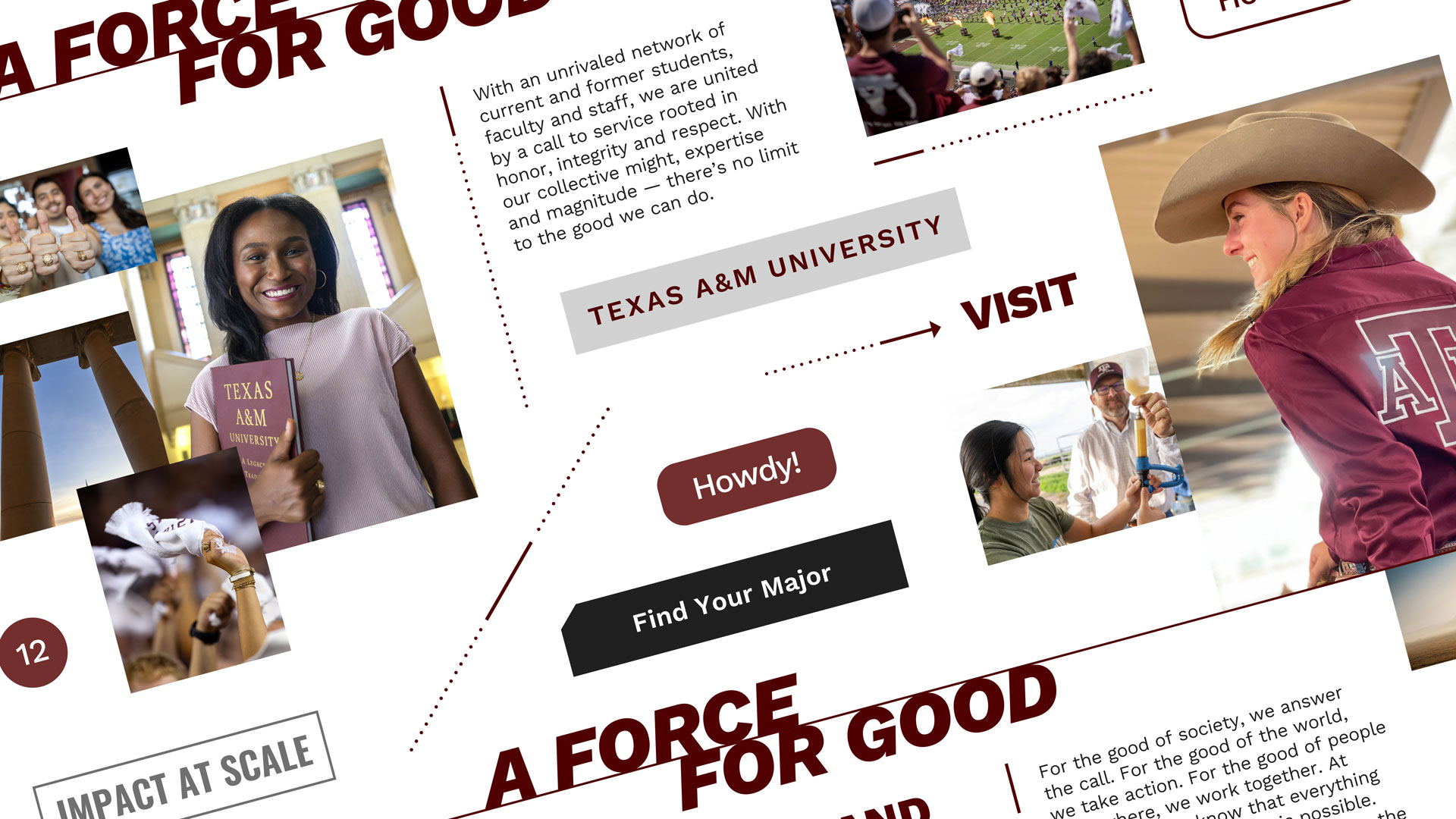
The Texas A&M brand uses a few distinct design elements throughout its marketing materials.
Updates to the visual style have been made to accommodate issues commonly found with branding on the web, including fonts and utility colors.
The Division of Marketing and Communications oversees standards for business stationery layout, content, change requests and quality control.
Typography is a robust vehicle for our brand voice. It contributes significantly to how our messages are read and communicated.
Please review our photography requirements before utilizing any of the Texas A&M provided templates or assets.
Please review our videography requirements before utilizing any of the Texas A&M provided templates or assets.
Learn how to correctly format your email signature for correspondence from your Texas A&M email account.
To align with the Texas A&M University brand and how we present ourselves as official members of the university community, follow these requirements for virtual media communications.
Branded Templates
We have provided an array of templates for use by marketers and communicators across campus to help foster a consistent representation of our brand.
Browse Templates